
Choosing a color for your kitchen is not just a question of aesthetics or fashion trends. The color scheme of your kitchen directly affects your mood, perception of space, and even your appetite. The kitchen interior is transformed when its design is approached with an understanding of how color influences appetite and the overall feeling of comfort.
Have you ever wondered why in some kitchens you want to linger longer, while in others you want to finish your meal as quickly as possible? The answer lies in the psychology of color! In this article, I will tell you about the important role of color in kitchen interior design and share practical advice on creating harmonious color solutions for your kitchen.
Color Psychology: How Kitchen Colors Affect Our Mood and Appetite
 Since ancient times, people have noticed that colors have different effects on a person's psychological state. The color palette of the kitchen and mood are closely related: some shades can stimulate or suppress appetite, others can create a feeling of comfort or coolness, visually expand or reduce space.
The influence of color in the kitchen is confirmed by numerous scientific studies. According to research from Cornell University, people dining in rooms with blue and purple walls consume 10-15% fewer calories than in kitchens with red and orange shades. Color therapy in kitchen design is not just a trendy concept, but a scientifically based approach. Experiments show that the brightness of lighting can change the perception of color saturation by 30%.
"Color is not just a decorative element in kitchen design. It's a powerful tool that can influence our mood, appetite, and perception of space. A properly selected color palette for the kitchen can not only transform the room visually but also create the right atmosphere for cooking and dining," notes Elena Markova, an interior designer with 15 years of experience.
Let's look at how different colors affect the perception of kitchen space and our appetite. Understanding the psychological impact of shades will help make the optimal color choice for your kitchen, taking into account the features of your space and personal preferences.
Warm and Cool Colors in Kitchen Interior
 When choosing a color scheme for your kitchen, it's important to consider the division into warm and cool colors. Do you feel the difference when you enter a kitchen decorated in warm sunny tones, or a room with a cool blue palette? Light and dark kitchens create fundamentally different emotional backgrounds. This is a fundamental principle of kitchen space color design that will help create the right mood and atmosphere in your home.
Practical Examples of Color Combinations
- Classic combination: beige facades + brown countertop + copper accessories
- Scandinavian style: white facades + light gray accents + natural wood
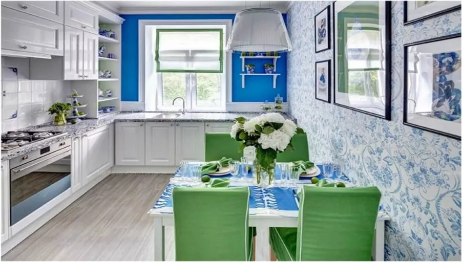
- Modern contrast: dark blue lower cabinets + white upper cabinets + marble countertop
- Mediterranean style: olive green facades + terracotta backsplash + white walls
- Cozy kitchen: color choice favoring warm wooden shades + pastel accent + brass details
The most popular kitchen colors in Europe today are various shades of gray, blue, and natural wood. In 2025, according to colorists' forecasts, natural green shades and earthy tones will be added to this list, reflecting the desire for environmental friendliness and connection with nature.
| Color | Psychological Impact | Impact on Appetite | Usage Recommendations |
|---|---|---|---|
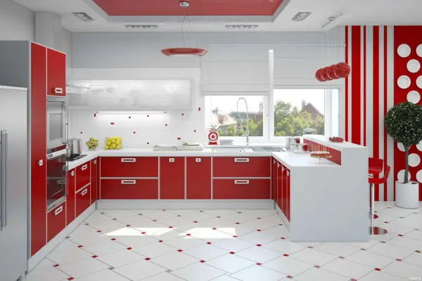
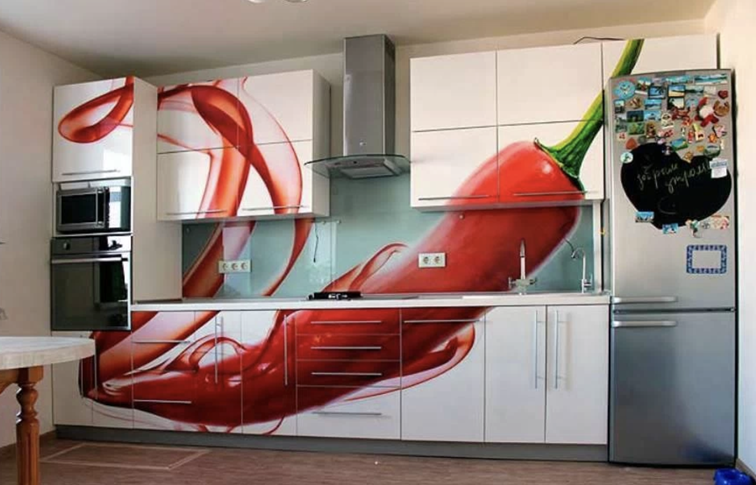
| Red | Stimulates energy and passion | Significantly increases appetite | Use as an accent color, avoid large areas |
| Orange | Creates cheerfulness and joy | Stimulates appetite | Good for dining areas, combine with neutral tones |
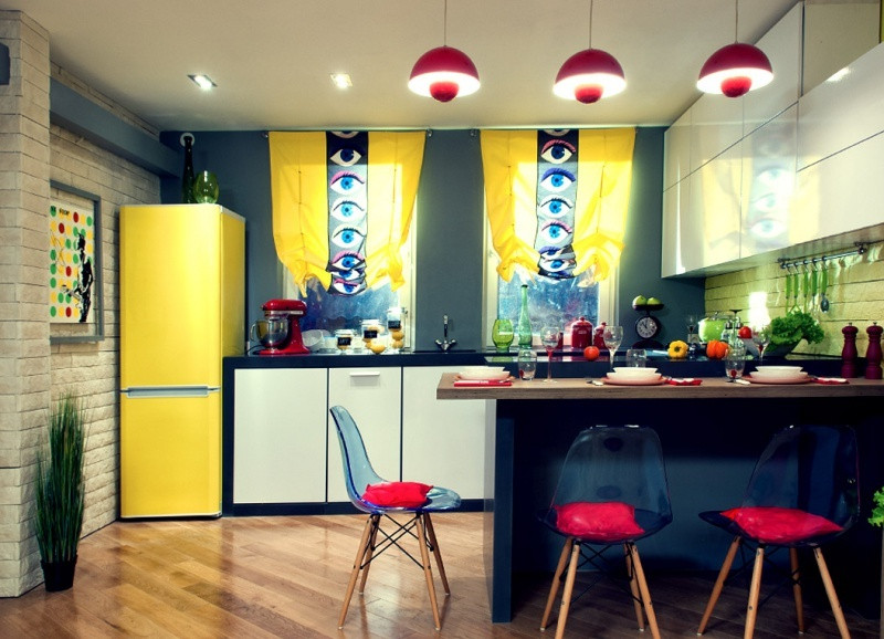
| Yellow | Symbolizes activity and optimism | Moderately stimulates appetite | Suitable for small kitchens, creates a feeling of sunlight |
| Green | Relaxes and calms | Neutral effect | Pairs well with wooden surfaces |
| Light Blue | Calms and reduces tension | Can reduce appetite | Best used in light shades or as an accent |
| Blue | Evokes trust and reliability | Reduces appetite | Not recommended as the main kitchen color |
| Purple | Associated with luxury | Can suppress appetite | Best used in soft lavender shades |
| White | Symbol of cleanliness and spaciousness | Neutral effect | Visually enlarges space, good base for accents |
| Black | Adds elegance and formality | Can create a heavy atmosphere | Best used as an accent or in combination with light tones |
This table clearly demonstrates how different colors affect our perception and eating behavior. When choosing a color for your kitchen, you should consider not only fashion trends but also the psychological impact of colors. Kitchen furniture: color choice should be based on understanding these factors, especially for surfaces that occupy a large area.
Color Solutions for the Kitchen: Practical Tips
 When creating a spectrum of shades for the kitchen, it's important to consider several key factors: room size, lighting, functional zoning of the kitchen using color, and personal preferences. Optimal colors for a small kitchen differ from those suitable for a spacious room. Here are some practical recommendations:
Visual Perception of Kitchen Space Through Color
 A properly selected color palette for the kitchen can visually transform the space. The optical effect of color in the kitchen is a powerful designer's tool:
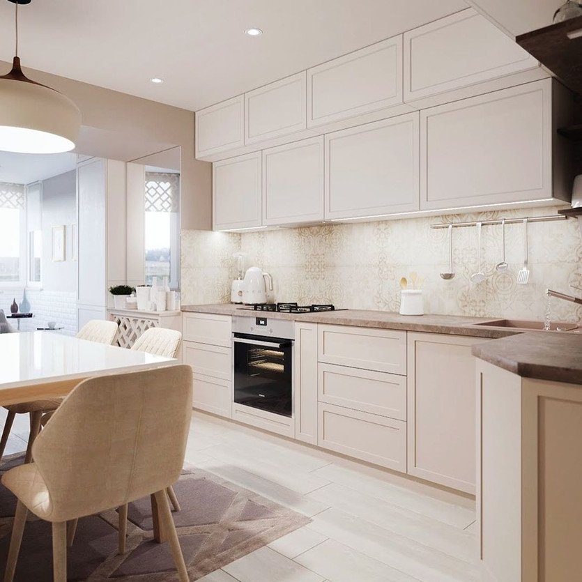
- For a small kitchen, it's better to choose light tones that visually expand the space. White, cream, light gray are excellent options for visually enlarging the kitchen.
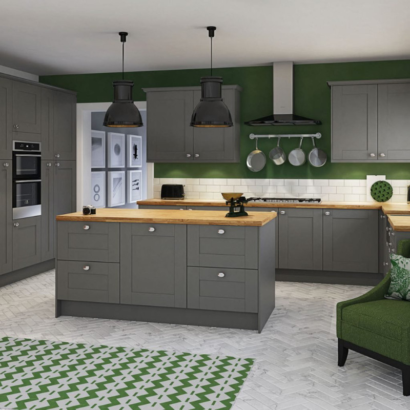
- For spacious kitchens, you can experiment with darker and more saturated shades.
- For low ceilings, vertical color elements are recommended.
- For narrow kitchens, a light color on the far wall will visually widen the space.
- Accent walls in the kitchen can become a bright center of the interior and correct the geometry of the room.
Choosing a color for a small kitchen is especially important since in a limited space each element plays a significant role. Visual expansion of space through color is possible with light shades and glossy surfaces that reflect light.
Color Combinations in the Kitchen: Principles of Harmony
 Creating harmony of colors in kitchen design requires understanding the rules of color combinations:
- The 60-30-10 rule: 60% of the main color, 30% of the secondary color, and 10% of the accent color.
- Monochromatic kitchen interior is built on one color of different saturation.
- Contrasting colors in kitchen design (for example, black and white combination) create a dynamic space.
- Analogous colors (adjacent in the color wheel) create calm harmony — why not use the principles of the color wheel to create the perfect interior?
Ergonomics and color in the kitchen are closely interconnected. Proper color zoning helps not only create an aesthetically pleasing space but also functionally organize work areas. For example, brighter colors can be used in the food preparation area, and calmer ones in the dining area.
"When choosing a color for your kitchen, it's important to consider the natural lighting of the room. In northern rooms with cold light, it's better to use warm shades, and in southern rooms with an excess of sun — cool colors. Do you need to consider lighting when choosing a color for your kitchen? Certainly, it's one of the decisive factors affecting the final perception of color," advises Mikhail Petrov, an architect and lighting design specialist.
Success Story: How Color Transformed My Kitchen
Two years ago, I faced the problem of updating my small kitchen with an area of 9 square meters. Dark brown furniture and beige walls created a feeling of tightness and gloom. After consulting with a designer, I decided on radical changes in the color scheme of the kitchen. We ordered a design project for the kitchen color solution, which completely transformed the space.
We chose light gray facades for the kitchen set, white walls, and a turquoise backsplash as a color accent in the kitchen interior. For the kitchen backsplash: color and style were chosen to create a bright but not flashy accent. The result exceeded all expectations! The kitchen not only visually seemed more spacious but also acquired a modern, fresh look. Guests often ask if I physically expanded the space — that's how effective the competent color solution was. This experience convinced me that the role of color in kitchen interior design is truly huge and can radically change the perception of even the most modest space.
Trendy Kitchen Interior Color Solutions for 2025
 Modern trends in kitchen design offer a variety of color solutions. Are you ready for bold experiments or do you prefer proven classics? Here are some fashionable colors for the kitchen in 2025 that can inspire you to transform your kitchen space:
- Natural shades: deep greens, earthy browns, and warm ochre tones bring us back to nature.
- Complex grays: gray-green, gray-blue, and gray-brown shades add depth and sophistication.
- Dark accents: black, dark blue, and graphite are used to create a dramatic effect in combination with light surfaces.
- Warm palette: terracotta, mustard, and honey give the kitchen a cozy atmosphere.
Kitchen sets: popular shades this season tend toward naturalness and eco-friendliness. If you're planning a turnkey kitchen color design, pay attention to combinations of natural tones with contrasting accents. It's important to remember that trendy colors are good for accents, but for main surfaces, it's better to choose classic, time-tested color solutions. Paint for the kitchen: which is best for your walls depends not only on aesthetic preferences but also on functionality — moisture-resistant, washable coatings are recommended for the kitchen.
"Many people think that a small kitchen can only be designed in white, but this is a myth. The main thing is to create contrast between work surfaces and facades, which will help structure the space. Even for a small kitchen, you can use dark colors if you properly balance them with light elements and provide good lighting," comments Anna Sokolova, a specialist in functional kitchen zoning using color.
The Impact of Lighting on Color Perception in the Kitchen
 Lighting plays a critical role in how we perceive colors. Even a perfectly selected color palette for the kitchen interior can look completely different under different lighting:
- Natural lighting — in the morning and during the day, cool colors (blue, green) look brighter, while warm colors (red, orange) may appear muted.
- Incandescent lamps — give all surfaces a yellowish tint, enhancing warm colors and muting cool ones.
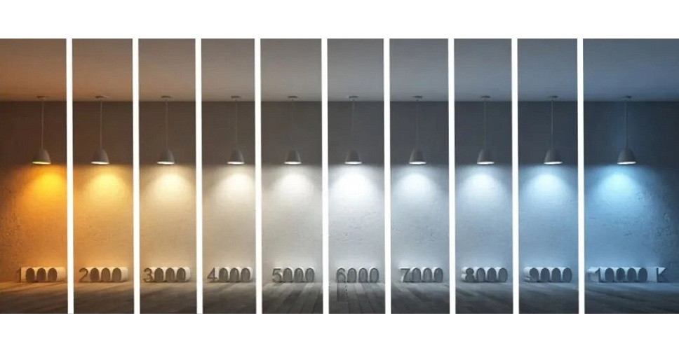
- LED lighting — depending on color temperature, can enhance either warm or cool shades.
- Directional light — spot lights create shadows that can change color perception.
It's recommended to check selected colors under different lighting conditions, both during the day and in the evening, before making a final decision.
Common Mistakes When Choosing Colors for the Kitchen
 Even experienced designers sometimes make mistakes in color palette selection. Here are common mistakes to avoid:
- Using too bright colors on large surfaces — over time, they begin to tire and irritate. Solution: use bright colors only for accents.
- Ignoring natural lighting — color can look perfect in the store but completely different at your home. Solution: test the color in real lighting conditions.
- Following trends without considering personal preferences — fashionable colors of the season may not match your lifestyle. Solution: choose colors that you really like.
- Unplanned color combinations — incompatible shades create disharmony. Solution: use color wheel rules for selection combinations.
Conclusion: The Importance of Color for Kitchen Interior
Choosing a color solution for the kitchen is an art of balance between aesthetics, psychology, and practicality. The important role of color in kitchen interior design goes far beyond the decorative function — through kitchen zoning with color and optimal shade combinations, we create a space that affects mood, appetite, and the overall perception of the room.
When developing the color palette for the kitchen and mood, consider the size of the room, lighting, style, and your own preferences. Competent color techniques for kitchen space will help create a harmonious place where it's pleasant to cook, dine, and spend time with loved ones. The volume and space of the kitchen can be visually changed through color, creating exactly the atmosphere you want to see in your home. And what could be more valuable than a cozy kitchen that becomes the heart of your home?